Sunday, October 28, 2012

Typography Journal Week #7


____________________________________________________________________________________________________________

Post #1


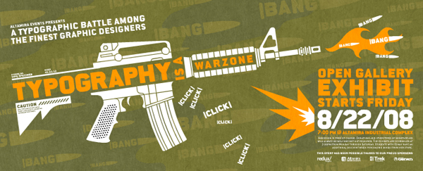
This a creative use of typography to really convey the message that typography is a war zone. Typography becomes the art of the image and it also enforces the message. The color, the arrangement, and the placement of the words unify the piece. 
___________________________________________________________________________

Post #2


This an incredible hand made logo because of the fine details of the typography. The style is so vivid and realistic. Even though there is no color, you can get the feeling of movies, theater, and Hollywood just by looking at the typography. Great integration of the film with the logo and excellent contrast between the typeface style.

Thursday, October 18, 2012

Typography Journal Week #6


____________________________________________________________________________________________________________

Post #1

This a beautiful of of typography because it composes excellent kerning, the ligatures and the ornaments complement the design and the emphasis on the 'R' really makes the piece complete. The use of color symbolizes status showing gold meaning rich, good quality and high class. There's this transition from small to large from the ends to the center which gives it more unity.
_____________________________________________________________________________

Post #2


This a great example of using different typefaces in a single design. We can see how script, serif, italic and sans serif are utilize in the design keeping it beautiful and simple. Even thought there is some distortion on the last two typefaces, the design still keeps a good image and the use of the feather really enhances the beauty of the design. 

Sunday, October 14, 2012

Typography Journal Week #5

____________________________________________________________________________________________________________

Post #1

First of all, there is poor arrangement of the words. The hierarchy is horrible which barely distinguishing the titles. The Excessive enlargement of the initials is irritating and confusing.  The kerning in the tittle is the only thing that really stands out and it was done this way to squeeze it inside the sign. 
_____________________________________________________________________________

Post #2

Sunday, October 7, 2012

Typography Journal Week #4

____________________________________________________________________________________________________________

Post #1

_____________________________________________________________________________

Post #2


Using to many different fonts like this is a really bad practice because it kills the readability completely and creates a lot of confusion. Some variety is good but this an example of too much variety. its bad for the reader to really understand the message and even worse for the designer for having such a bad habit.